July 24, 20104 min read, 701 words
Published: July 24, 2010 | 4 min read, 701 words
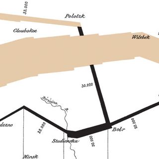
“The best statistical graphic ever drawn“, is how statistician Edward Tufte described this chart in his authoritative work ‘The Visual Display of Quantitative Information’.The chart, or statistical graphic, is also a map. And a strange one at that. It depicts the advance into (18...
CRITIC REVIEWS
There don't seem to be any reviews yet.
PUBLIC REVIEWS
There don't seem to be any reviews yet.
